
Moneymaking Machines #13: The Flatiron Building

I know I shouldn’t be interested in architecture as moneymaking machines. Even as a guilty pleasure, it’s increasingly not that much fun. I’m obviously an addict. This may be the last of this series of posts. You’ll understand why at the end. I thought my undergraduate first year architecture history book may have been my first encounter with what will always be The Flatiron Building but no. I couldn’t find it. I must have seen it in some library book before. The intersection of Fifth Avenue and Broadway was always going to be a special place in terms of urban geography and history. Delirious New York meets Mannahatta (Mannahatta: A Natural History of New York City)1 and so on. It’s not all that strange that instead of being celebrated as open space, the site was exploited to the full extent of its scalene footprint. The intersection of Broadway and 6th Avenue has open space but only because there’s not enough of it for a building. Still, those windows at the sharp angle do have a great view. Not that it mattered much to office workers between 1902 and approx. 2022. Clearly, the 1902 building didn’t know what a hot property it was! Here’s a view we’ll never see again.2

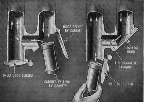
Most of the offices in this plan have a corner with some sort of office equipment. It doesn’t look like heating. I’m guessing, but they might be part of a pneumatic tube system3 for conveying documents or small parcels (or whatever can fit into a capsule of predetermined size) within buildings such as offices. That’s exciting! If you think about it, it’s actually a steampunk internal e-mail system that sends physical correspondence between a sender and a recipient. The system could be extended to incorporate adjacent buildings or entire sections of cities. Similar pneumatic systems still exist but mostly for the transport of physical things such as phials of blood samples within hospitals.


What else can we say about this typical floor?
- The only light the elevator lobby and corridors would receive was via the glass doors and the glass panels above them.
- There are three internal rooms.
- All offices have internal doors so tenants could rent one or a set of rooms. I imagine private detectives.
- The elevator lobby is spacious.
- There doesn’t seem to be many toilets, let alone gendered ones. Alternate floors?
- Fire escape wasn’t a huge concern, even though those detectives were always smoking. And with all those wastepaper baskets around.
But the building was a bit behind the times for an office building, especially in the 1950s when management were given the perimeter rooms with a window, senior management the ones on the corner and everyone else the windowless space in the middle. Did you notice in the archive floor plan above how the premium office at the acute angle of the triangle doesn’t have one of those (supposed) pneumatic device thingys? The linked office is obviously for the private secretary who takes that person their information. Guessing again.

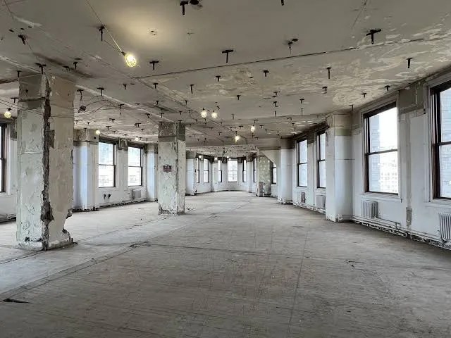
Open floor plan and flexibility became a thing. Space became something to be partitioned rather than something with brick walls in structural bays. The Flatiron Building didn’t age well. We don’t call it The Fuller Building which was the original name. Our penchant for giving buildings stupid names is not a new thing. This next image shows the interior of the building prior to conversion and refurbishment. It looks like the building had an interim stage where the internal partition walls had been ripped out to create leasable office spaces as large as possible and in the hope that the location would continue to be an attractor.

It didn’t. The Flatiron Building building was sold sold at auction in 2023 and The Brodsky Organization and The Sorgente Group had it converted by SLCE architects into 38 residential units with a combined selling price of $380,860,000. That’s an average price of $10 mil. but I haven’t seen any on the market for less than $12 mil.4 These next two layouts are of different levels, the one above being the 1902 reality and the one below being the 20th floor unit which is the current reality. Across all floors though, the elevators and stairs have been completely rebuilt even if the fire escape stairs were modified to be code compliant some time back.

There are now only two passenger elevators and one service elevator but this is probably sufficient as the building is only 20 stories and, in a residential building, it’s unlikely for everybody to be coming or going at the same time. The building is 20 stories (though some say 22), and all but the topmost floor have two units, arranged as below with one of two types of “corner” unit and one of two types of “end” unit. It’s reasonable. Getting the internal walls to align with the windows is the most difficult part of problems like this and I can’t see many of those signs of a struggle that are often called “quirks”. Nevertheless, one of them is that 45° angle corridor outside the master bedroom so people can go between the master bathroom and master bathroom without passing through the bedroom area. It’s also slightly weird that the dressing area is larger than the kitchen but I don’t see this 20th floor unit being used as a family house. I know it’s only floor plan space filling but, in unit 127 North below, the juxtaposition of breakfast counter and baby grand in the layout below is mildly bizarre.


Many marketing websites mention the visible steel frame as a selling point. I know they’re referring to those steel columns we can see on-grid in the north-end units but I seriously hope they have been relieved of their structural obligations. Two more pop up as features in bedroom 3 and bedroom 5 on the east side of the penthouse unit. Ones in the 17 North unit in the plan above occur as deliberately exposed features in the dressing room and along the corridors. When fire steel not good. I can’t tell what engineering magic makes the structural functions of those steel lattice columns redundant but, if there is, it’d be a poor use of budget to duplicate their function for the sake of a marketable feature. It’s easier to believe they have been confidently coated with some miracle new fire protection substance. Mmcht. This is how you write the sound of sucking one’s teeth. In Japan, sucking one’s teeth while making a concerned expression without meeting anyone’s eyes is understood as a public expression of private doubt. Still, somebody has signed-off the scissor stair and fire escape distances so who’m I to say? Still, there’s something strange about these columns. I don’t understand how something so essential can be so visually jarring, as if it is in the wrong place and the wrong time. My unease might be because the columns no longer structure the spaces they are in.

The basement level now has a swimming pool and it can’t have been easy finding that large a space while dodging the elevator shafts. The entry level is double height but overlooked by some sort of club room mezzanine. Assuming entry level and half level count as one, then that’s only 37 units because there’s only one on the uppermost floor. There may be another somewhere. It doesn’t matter. These next images are probably “visualizations” – a term that’s already archaic.
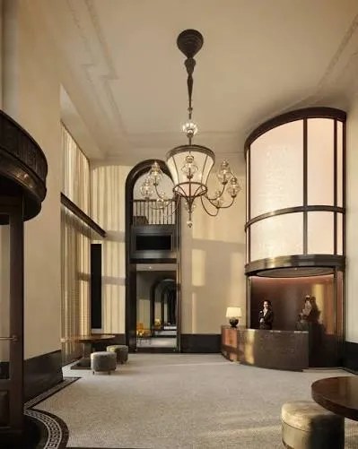


Marketing websites, of which there are many5 6 7 8, never fail to use adjectives like “historic” or “iconic” but I’ve yet to see a mention of Daniel Burnham’s name. Note to architects: Designing a building that will survive to be historic one day, doesn’t mean anyone will care who designed it. Wikipedia9 also mentions a Frederick P. Dinkelberg who was Burnham’s associate for the design. No chance. Historic clearly just means “old” and has no connection to any history in the historic sense of the word. History shows itself in the feature steelwork and the shell only. There’s nods to history in the entrance lobby, the elevator lobbies, the clubroom and even the swimming pool but, once you’re home, there’s no need to be troubled by it. The interiors we see photographed are by Studio Sofield10vwho seem to have a lot of experience with commissions like this. I’m not complaining about the beige or the generic art. These are placeholder interiors and a bit anodyne but, as is the way with these things, it’s probably not that important. What is important is that you and your guests can stand in front of those windows and look out and know that you are not on the outside loooking up.
In 2023, The Flatiron Building was sold for US$161 million.11 The 38 residential units have a current combined price of US$381 million. The Flatiron Building was no longer viable as a commercial office building so it’s no surprise it’s been converted to high-end residential. I’m always gladdened to see buildings not being used for the purposes for which they were designed but, apart from that steel structure revealed as decorative feature, there’s nothing else that allows us to sense that in this reworking. Having said that, The Flatiron Building is probably living its best life and it seems a methodical working through of a brief. The building is probably living its best life but I can’t help thinking “Is that all there is?”12


•••

- Mannahatta: A Natural History of New York City – a cult book from 2009. https://www.amazon.com/Mannahatta-Natural-History-York-City/dp/0810996332 ↩︎
- https://en.wikipedia.org/wiki/Flatiron_Building ↩︎
- https://en.wikipedia.org/wiki/Pneumatic_tube ↩︎
- https://www.cityrealty.com/nyc/flatiron-union-square/flatiron-building-175-fifth-avenue/apartments/187971 ↩︎
- https://www.theflatironbuilding.com ↩︎
- https://streeteasy.com/building/the-flatiron-building ↩︎
- https://www.cityrealty.com/nyc/flatiron-union-square/flatiron-building-175-fifth-avenue/187971 ↩︎
- https://www.brodsky.com/sales/flatiron/the-flatiron-building ↩︎
- https://en.wikipedia.org/wiki/Flatiron_Building ↩︎
- https://www.studiosofield.com ↩︎
- https://nypost.com/2026/04/06/real-estate/grand-58-5m-home-in-the-flatiron-building-enters-contract/ ↩︎
- https://www.youtube.com/watch?v=xA4MqONunGo ↩︎
•••

“Going Outside“

“Living As Art“

“Food and Shelter“
Share this:


Graham McKay
says:It’s good to see someone else finds it interesting to think about the decisions that were made for something to be the way it is. Judging from construction photographs, it doesn’t look like there was that much concrete in the building.


Since the core has been completely rebuilt and extended, it’s possible that it’s the main rigidity element now, with new beams extending to the perimeter walls (most noticeably in the dining area of the penthouse).
This could make any residual structural function less crucial. It would also be more beneficial both for construction and, as it turns out, for marketing, for those new beams to avoid the existing structure, freeing them up to be decorative features, even if they’re somewhat lost in time. If this hypothesis is true, then it was the fate of those columns to be features. If the floors are essentially steel stiffening plates, then I don’t think those columns ever carried much deadload other than to prevent sag in the middle parts. Spacers effectively. Inventive. Just as an afterthought, because of the arched windows, that kitchen photo showing two columns must be from a unit on one of the uppermost floors (possibly the 19th) so maybe a lattice column is sufficient. I’m not saying the lower columns are necessarily more beefy but from what I’ve read, much faith was placed in prefabrication and the riveting of pieces of steel together.
victorperunkov
says:Hello!
This exposed steel trusswork definitely looks frail to bear a building’s weight. If only twenty stories, still I would expect solid H-shapes resisting horizontal shear and buckling and transferring the actual weight down – through an uninterrupted continuous section.
We see trusses in roofs, communications towers or voltage line and railway gantry. All of these do other work beside self-support, but their mission is to be rigid enough with the least material used. Nowhere are these structures to be seen bearing stacks of building floors. External rigidity latticework at best. Even warehouses built of trusses have actual solid columns, even if these may form a twin, lattice-bound, one – where one stem bears the roof and another the overhead crane girder.
The ironic argument against the latticework column is that trusses use less matter through use of more space. In case of a column. this space would be taken out of the very floor area that one desires to sell. So well for the moneymaking machines.
With that in mind, one may think that these columns might work as rigid struts against slab buckling, but again, resisting a slab’s deformation would mean actual weight transfer it looks unfit for. Rigidity without strength suggests this steel could have been the actual steel of the (original?) reinforced concrete columns, holding the vertically strained concrete in place. But again, did they do reinforced concrete in the US at that time? Wikipedia article suggests a steel frame and no mention of latticework.
With the layouts, I think that the shape is an external blessing and an interior curse. The shell being completely gutted, while branded as historic, supports that. (Rarely there are other modes of working with old buildings). The big double-lit triangluar room is surely cool. But none of the furniture setups are convincing. My hunch was that a dining table would work there at the corner, but that would make the room more of a family villa dining hall than a metropolitan lounge. And kitchen would have to adjoin, destroying the rest of the double-lit space. But surely the petite coffee table is an abysmal use of that corner, unlike that original shot of an office.
In the end, I think that its corner is the place for the grand piano, as it would not require everyone reaching it through the narrowing room, it would surely be the centerpiece of the salon, and hopefully the pianist would enjoy commanding this position, even if only being able to look around at the end of their performance. Expanding room shape might also work acoustically.
You mention “floor space filling” taking place and that is an established phenomenon. It makes me wonder what is an architect to do there decently. “The client rips everything off” is a justification for the designer to phone it in. One may want to devise a plan that does not require ripping it apart. The first clause is also a way to sanction intended production of construction waste.
Of the Moneymaking Machines, the 432 Park Avenue has made youtube complain about its swivelling and plumbing failures. I wonder how SHOP-designed “The Steinway tower” fares, having claimed its superior slenderness. It has massive shear walls in place of an inventive concrete framework though.