
Inverted Space

The two posts Architecture Reductions from December 2015 and Final Reductions from October 2018 ran with the idea of what could be done away with in residential space or, more to the point, what would remain. In rough sequence there were Ornament, Outdoor space, Fireplaces, Dining Rooms, Separate rooms, Kitchens1, Quality materials, Interior finishes, Design features, The Plan, Privacy and most of these have, at some time, been heralded as characteristics of a new type of space, if not architecture. If we’re trying to pare down residential space so it can be built more economically and in theory affordable to more persons, the question is what can be taken away and what’s left? Or more to the point, how to make best use of what’s left.
Even after a hundred years, there’s the persistent idea that reduction in residential architecture is about reducing the build cost by reducing the area.2 3 Every now and then this idea gets extended to volume, usually with a sleeping space on top of the entry, kitchen and bathroom spaces. On the left below is a typical arrangement for this. This idea of stacking spaces that don’t require “full” height has also been around for a hundred years.4 5 We’re taught that circulation space6 is space wasted through poor layout design but the middle and right examples below each use approximately one third of the floor area to access the spaces for other activities even though we know that, when it comes to hotel rooms and residential units, double-loaded corridors are better than single. Splitting the shower room by the corridor would reduce its length and the area of corridor necessary to get past it.


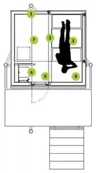
Each of the above examples has its problems. The first has a large floor area but a more than minimum height for part of it. There’s also the matter of the space (albeit not much) used to go between levels. The second example has no window for the sleeping area, while the third one does, but it requires the sofa to convert to a bed. It’s a lazy variant of Japanese space in which objects are reconfigured to enable different activities.7 The extreme example on the left below has convertible furniture and a single activity space to access all there is to access. It’s problem is that there’s only one place to be. As an idea, Sou Fujimoto’s Final Wooden House (right) did at least offer four or five different places along its spiralling corridor. The middle image is of some New York apartment where the activity spaces for kitchen and one side of the bed are overlapped and also the corridor to the bathroom.
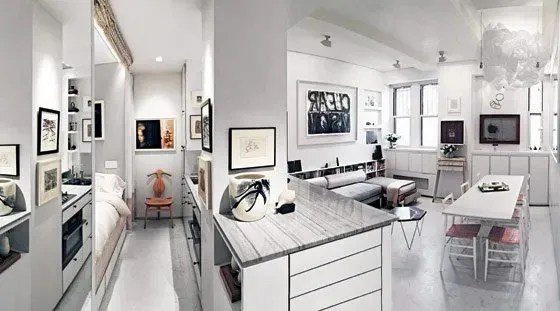

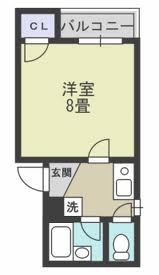
These next three examples of one-room Tokyo apartments all have the corridor with the kitchen on one side of the corridor and the bathroom on the other, and between the front door and the single large space in which all non-cooking and non-bathing activity takes place. Essentially, it’s a room with separated wet areas. The problem is that cooking, bathing and circulation are physically and conceptually separate from that space even though they take up half the area there is.


Akio Yachida8 treats the cooking, bathing and sleeping spaces as a single fixture that occupies one end of a large space, the full extent of which can be seen. Spatially, this is a useful invention but construction costs in Tokyo are quickly making the extra-height volume unfeasible yet, without it, the interior becomes cubic with the living space above the entry and wet areas.


Last weekend I stayed two nights in a hotel room that made me think again about spaces, activity spaces and corridors. The building has the look of adaptive re-use but very little has been re-used as a new structure has been built inside an existing one.9 The hotel was the front third of the building, with another hotel at the other end, with some commercial space in the middle third.

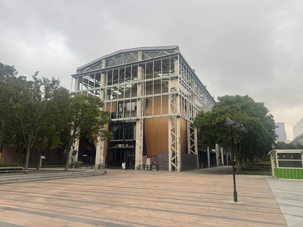

There were about fifteen rooms, all with a large Japanese-style bath and one or more quirks. No two were the same. The central suite had no windows but there was a Japanese-style bath, a jacuzzi as well as a sauna. My room was the one shown in yellow below. It was maybe 20 sq.m but felt larger and ever since I’ve been trying to think why.

- There might be ways of achieving efficiency other than by putting objects or spaces in a minimal area and adding a minimal amount of space to access and use them. Like many small apartments, this room had a corridor from the entrance to the balcony but down the middle rather than the side. For most of its length there were spaces or things on both sides and, for the most part, these were activity spaces as well. Importantly, this corridor wasn’t straight.
- It might be important that it didn’t seem bounded by four walls, as if were a rectangle of space with identical ones on each side.
- The shower was only half the depth shown in the plan above. It felt like it was at the end of the corridor in that direction.
- There were three distinct places to be, four if we include the washroom and five including the balcony.


- The bathroom was split into three. There was nothing unorthodox about having the washroom next to the entrance, but the shower was around the corner and the bath was around another corner. Importantly, it wasn’t possible to see the entire space from any one position. If the space for the entrance corridor and the space for the bed are thought of as one L-shaped space, and the space in front of the shower and beside the bath are thought of as another, then there is a change of floor finish and of ceiling height where those two L-shapes intersect, dividing the entire space into “wet” and “dry” areas. (The bathwater wasn’t heated to anywhere near the Japanese ideal temperature for soaking but, if it were, the bath would need to be in a separate room.)
- If you go back to the first of these faux panoramas, you’ll see a bench outside the shower and directly in front of the balcony door. This was a surpsingly pleasant place to sit.


- The bath was adjacent to the balcony and the only window and view out. This isn’t the normal hierarchy of space. It’s inverted. Remember – you heard it here first! It also makes daylight and the view something special. Because of this, the combined living and sleeping space has no window.


- This space is like a traditional Chinese kang10 raised platform where all daytime activity takes place. It’s the physical and conceptual centre of the space. This one had a television projector instead of a flatscreen. It took me a while to work out that I had to fold up the futon and stack the pillows, and then bring out the desk and cushions. I’m not sure I’m sufficiently culturally sensitive to want to work [read, write] like in this position for extended periods of time, unlike tourist guy above who didn’t have to deal with a laptop.


There aren’t many things about this arrangement I’d change if I were to live in a space like this long-term.
- I’d like a bit more storage – for clothes, mainly. This might have to go along the wall just inside the entrance. Or it could go along that space on the way to the bath and the balcony. Storage of bedding and things like suitcases may be best beneath the kang.
- I’d like some space for the storage and preparation of food. It doesn’t have to be large. Perhaps this kitchen space would be a better use of that wall space inside the entrance. This food space needs thought b because it depends on what food options are available, the importance of the act of cooking and serving food, and the physical mechanics of a sources of heat, coolth, water and ventilation. Much as I enjoy cooking, I’m not sure it’s worth the trouble spatially. It might be time to have a communal kitchen and a social space to eat, such as suggested in the floor plan above. I never did find out what that space was for. There was a table for ten, surrounded by lockers and changing rooms.


- In this hotel, the bath is a symbol of ritual, and has been given a space commensurate with its symbolic importance. If it were to function as a hot, soaking bath, there’d need to be a (sliding, concealed) glass door to isolate the steam from the rest of the space. The bath could become a hot tub on the balcony but then the remainder of the inside space wouldn’t make sense anymore but, given my current usage of time and space, I’d make the bath space a library/study and have a hot tub on the balcony. The problem with this is that’s it’s basically the situation I have now. Whether or not my desk is as much of a ritual to me as a soaking tub is to Japanese is a valid question. The Open Bathroom11 is a feature post this week.
- Perhaps a low storage unit at the head of the bed or along one side of it, or both. The kang space is very important but I’m not sure if it needs more design or less.
• • •
- https://misfitsarchitecture.com/2023/06/25/obit-the-kitchen/ ↩︎
- https://misfitsarchitecture.com/2013/03/20/the-microflat/ ↩︎
- https://misfitsarchitecture.com/2015/05/25/1928-the-types-study/ ↩︎
- https://misfitsarchitecture.com/2015/08/02/architecture-misfit-17-moisei-ginzburg/ ↩︎
- https://misfitsarchitecture.com/2015/05/09/1927-the-competition/ ↩︎
- https://misfitsarchitecture.com/2015/08/18/the-forgotten-function/ ↩︎
- https://misfitsarchitecture.com/2026/04/26/architecture-myths-33-flexibile-space/ ↩︎
- https://misfitsarchitecture.com/2025/08/24/role-model/ ↩︎
- https://au.trip.com/hotels/shanghai-hotel-detail-60983627/xiaozun-sitang-hot-spring-hotel/ ↩︎
- https://en.wikipedia.org/wiki/Kang_(heated_platform) ↩︎
- https://misfitsarchitecture.com/2018/09/23/the-open-bathroom/ ↩︎

“Mock 3D Printing“

“The Open Bathroom“

“Moneymaking Machines #1: 432 Park Avenue“
This Subscription button below is a new thing that will appear at the end of every post from now. Just type your email address to be notified of new posts, most likely on Sunday mornings when I usually post. It says “Subscribe” but it’s really just “Follow”. I know many people read these posts via LinkedIn but the problem with that is the posts quickly get bumped down the infinite scroll.
Share this:

